NERUDO · Brand system 01
Care in the craft.
Clarity in the result.
A shared identity for two ways of working. Familiar desktop precision, or an organic modern workspace.
Modern by choice.
Identity
Good work takes form.
Independent craft.
Considered decisions.
Work brought together.
NERUDO takes its root from neru — 練る: to knead, refine, or develop a plan. The discipline of a fine bowl of ramen informs our approach: prepare carefully, balance deliberately, and make the result satisfying to use.
Dough in motion.
Drawn into form.
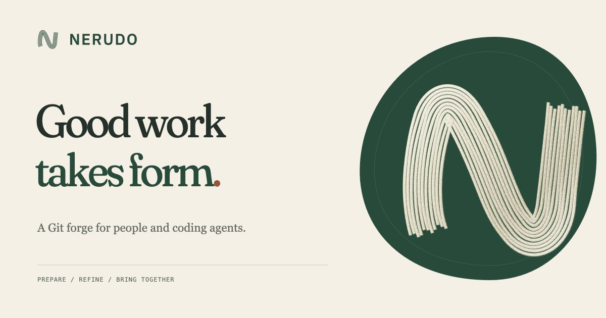
The warmth of ramen. The discipline of a forge. Fine noodles gathered with care, then shaped into a clear N.
Eleven flour-dusted noodles share one clear N contour, with fine gaps and uneven cut ends.
Prepare with care
Make context, intent, and constraints easy to understand before work begins.
Refine with judgment
Show alternatives and the reasoning behind a choice. Readiness should be visible.
Bring work together
Keep independent contributions coherent through clear order, review, and feedback.
The Strand mark gathers fine handmade noodles into an N. Pale dough, flour texture, slight variation, and uneven cut ends shape the display treatment. Leave one bundle-width around it. Minimum size: 16 px for the mark, 96 px for the full lockup. Use five strands in the flat mark and the three-strand version at 24 px and below. Keep the gaps open and preserve its proportions.
Color
Warm foundations. Clear signals.
Select a swatch to copy its color.
Kombu carries primary actions. Toast is reserved for focus and small accents. Status colors always appear with a readable label or glyph; color alone never carries meaning.
Typography
Human voice. Precise detail.
Good work takes form.
Give every approach room to develop. Keep the reasoning close to the work, and make the next step clear.
git push origin my-change
Retro keeps Tahoma/Verdana at 12 px and Plex Sans display type. Modern pairs soft Fraunces headlines with Plex Sans at 14 px. Code uses Plex Mono in both. Expressive type belongs to the brand; controls and dense information remain easy to scan. Fonts are hosted locally under the included SIL Open Font Licenses.
Interface
One product. Two presentations.
The desktop, considered.
Raised controls, compact rows, warm surfaces. The preferred first-visit experience.
Pull request #42
Format receipt prices
Needs reviewUse the project’s existing formatter so every receipt follows the same currency rules.
- ✓ChecksBoth example checks passed
- ≡ContextReasoning recorded
The style switch applies across the whole site and persists between visits. Layout, spacing, and control treatments change; repository access and decisions use the same application.
Interactions
Every detail earns its place.
- One clear next step
- Give each decision one primary action. Keep secondary actions quiet and nearby.
- Readiness has a reason
- Pair every state with words and a glyph. Explain what is needed and who can act.
- Keep context in place
- Review and refine inline. Preserve selection, scroll position, and the user’s work.
- Make feedback specific
- Say what changed. Keep progress, empty, error, and permission states distinct.
- Keyboard is a first-class path
- Keep shortcuts in both experiences. Show focus clearly and retain predictable tab order.
- Motion follows the action
- Use 120 ms for hover and 180 ms for interface feedback. The strand takes 680 ms to settle into form after a deliberate choice. Honor reduced motion; useful actions respond immediately.
“This approach needs one maintainer signature.”
“Comment posted.”
“We couldn’t load this review. Try again.”
Use the familiar product words: repository, pull request, task, review, agent, release. The food inspiration shapes the care we take with the experience.
Assets
Ready to use.





NERUDO carries through the product: the website, CLI, configuration, and integrations share one name. Existing credentials and repository history continue to work as they migrate.